← All projectsDesign2023/24
Water Crisis
A typographic poster series on the 2014 Detroit water shut-offs.
- Role
- Graphic Designer & Data Visualiser
- Team
- Solo
- Context
- Fundamentals of Design & Typography — HM Munich
- Tools
- Adobe Creative Cloud
(In short)
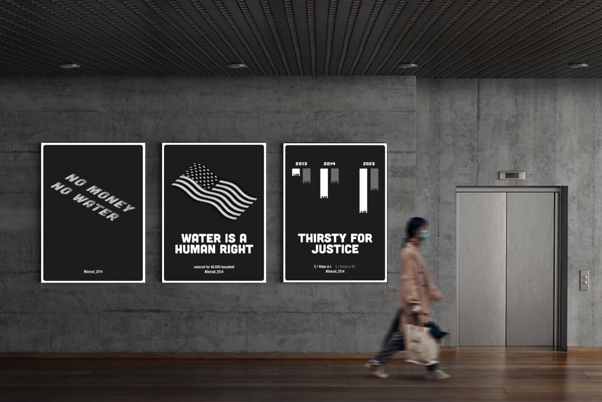
For the Fundamentals of Design & Typography course I created a poster series about the 2014 water crisis in Detroit, when tens of thousands of households had their water cut off. The goal: make a complex, political issue visible at a glance through typography, data and contrast.
The brief
Make a socially relevant issue tangible through design. I chose the 2014 Detroit water shut-offs: an issue that is about money, rights and justice at the same time.
Three posters, three angles
- "No money, no water" — the mechanism: access to water tied to the ability to pay.
- "Water is a human right" — the principle, set against the American flag.
- "Thirsty for justice" — the data: rising water prices over time, shown as a minimal bar chart that reads like dripping water.
Design decisions
- Black, white, nothing else. Removing colour forces the message to carry itself and makes the series cohesive.
- Typography as the main image. Type is set at a scale and angle that creates tension, so the words become the visual.
- Data that's felt, not read. The chart is simplified until a passer-by gets the trend in a second.
What I learned
Clarity is a decision about what to leave out. The same discipline applies to a product brief or a roadmap: one clear message beats five correct ones.